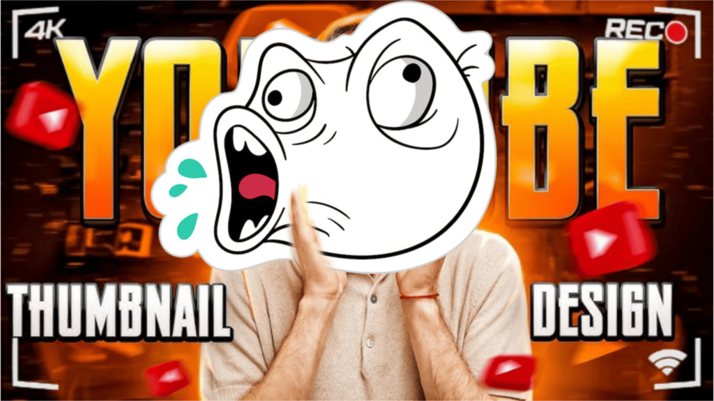
How to Edit Eye-Catching Thumbnails for YouTube: A Step-by-Step Guide
If you’re a YouTuber, you probably already know the power of a killer thumbnail. It’s the first thing viewers see when deciding whether to click on your video—or scroll past it without a second thought. So, what’s the secret to crafting that irresistible visual hook? Let’s break it down step by step and sprinkle in a few pro tips along the way.
Why Thumbnails Matter More Than You Think
Ever judge a book by its cover? Yeah, we all do. Thumbnails are basically the book covers of YouTube. A well-designed thumbnail can boost your click-through rate (CTR), helping your content get the attention it deserves. And you know what? Even the best video can go unnoticed if the thumbnail is boring or cluttered.
Step 1: Start with the Right Dimensions
First things first, make sure your thumbnail is the right size. YouTube recommends 1280 x 720 pixels with a minimum width of 640 pixels. The aspect ratio should be 16:9, which fits perfectly on most screens.
Pro Tip: Stick to PNG or JPG formats and keep the file size under 2MB for a smooth upload.
Step 2: Capture a Powerful Still Image
Forget the generic freeze-frame that YouTube auto-generates. Instead, pick a frame from your footage that shows action, emotion, or intrigue.
If nothing stands out, don’t be afraid to pose specifically for your thumbnail. Yeah, it might feel a little awkward at first, but trust me—it works.
Step 3: Craft Bold Text that Pops
You don’t need to write a novel on your thumbnail. Short and snappy phrases work best—think 3 to 5 words max. Use fonts that are clear and bold even on small screens.
What Works:
- High contrast between text and background
- Sans-serif fonts like Montserrat or Impact
- Shadows or outlines to make text stand out
Step 4: Use Color Strategically
Colors evoke emotions. Warm tones like red and yellow grab attention, while blues and greens feel calming.
Pro Tip: Stick to a consistent color scheme for your channel to build brand recognition.
Step 5: Add Visual Elements with Meaning
Arrows, circles, and icons can direct attention to key parts of your thumbnail. But don’t overdo it—no one wants to see a cluttered mess.
Step 6: Bring It All Together with Editing Tools
You don’t need expensive software to create amazing thumbnails. Here are a few popular tools:
- Canva: User-friendly with pre-made templates
- Adobe Express: Offers more advanced features
- Figma: Great for collaborative design work
- PicsArt: Perfect for mobile editing
Play around with layers, transparency, and shadows to make your thumbnail visually appealing.
Step 7: Don’t Forget the Human Touch
People connect with people. Thumbnails with faces tend to get more clicks—especially when those faces show strong emotions like surprise, joy, or curiosity.
Common Mistakes to Avoid
- Overcrowding: Keep it simple.
- Poor Readability: If your text is hard to read, it’s game over.
- Inconsistent Branding: Viewers should recognize your thumbnails at a glance.
- Clickbait: Don’t promise what your video can’t deliver—your audience will feel cheated.
Real Talk: Thumbnail Trends to Watch
Trends come and go, but keeping an eye on what’s working for other creators can spark fresh ideas. Lately, minimal designs with a focus on bold text and a single captivating image are performing well.
Final Words of Wisdom
Creating eye-catching thumbnails isn’t rocket science, but it does take a bit of trial and error. The good news? You’ll get better with every attempt. So go ahead—experiment, learn, and watch your audience grow.
And remember, your thumbnail is the first handshake between you and your viewer. Make it a firm one.